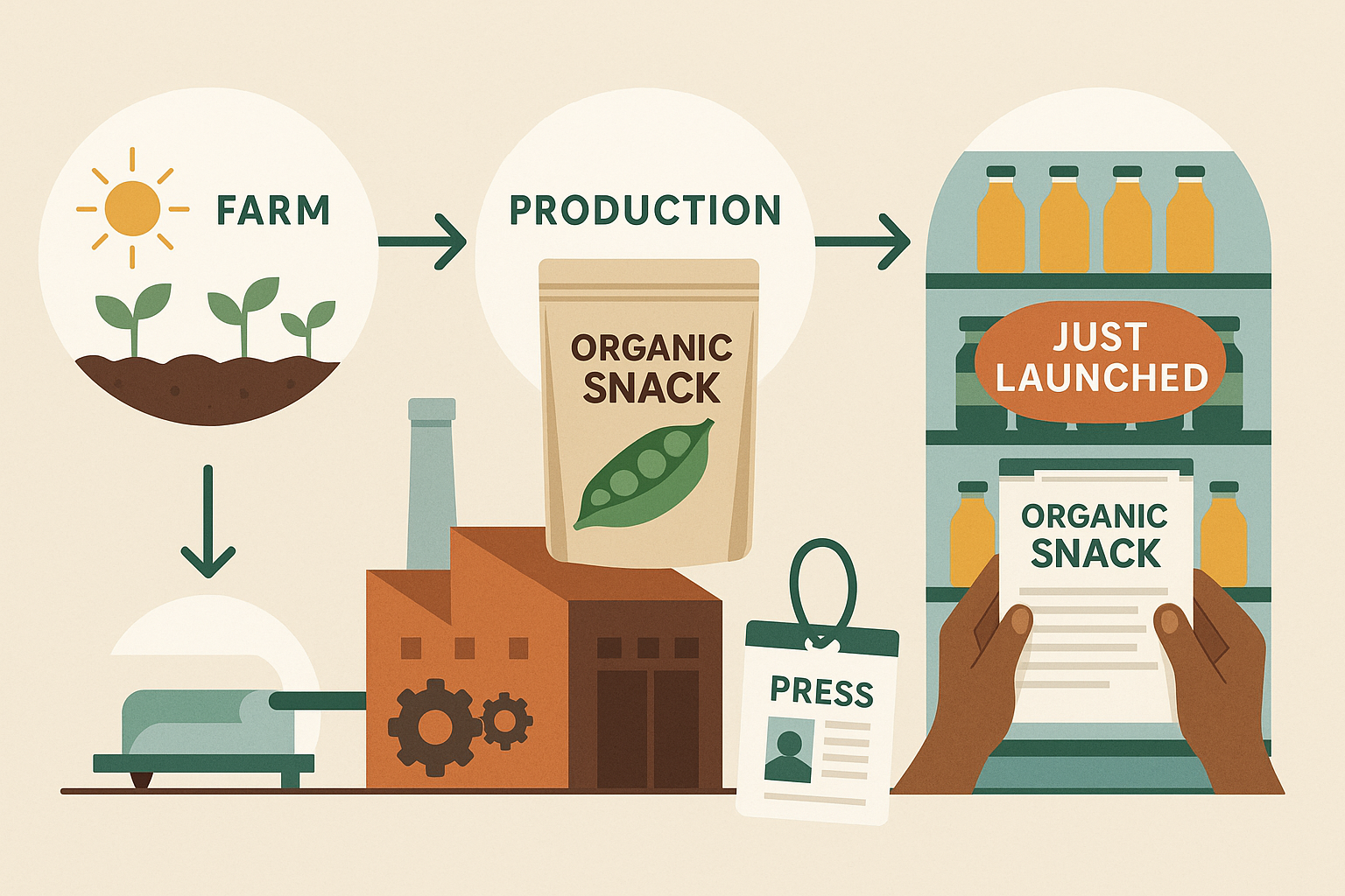
Packaging Peace: Visual Identity in Wellness Brands
tag-thi
Packaging Peace: Visual Identity in Wellness Brands
Walk down any wellness aisle in 2025 and you’ll notice a clear trend: tranquility. From pastel color palettes to rounded typography, today’s wellness packaging is built to signal calm, safety, and a sense of control. But behind that serenity is a high-stakes branding game—one that requires clarity, consistency, and true emotional intelligence.
If you’re building a wellness brand, your visual identity isn’t just a design choice. It’s a promise. Here’s how to make sure your packaging delivers peace—without putting people to sleep.
1. Start With the Feeling, Not the Font
Before opening a design file, ask: how should this product make someone feel?
- Safe?
- Grounded?
- Empowered?
- Refreshed?
Anchor your visual language in a desired state, not just an aesthetic trend.
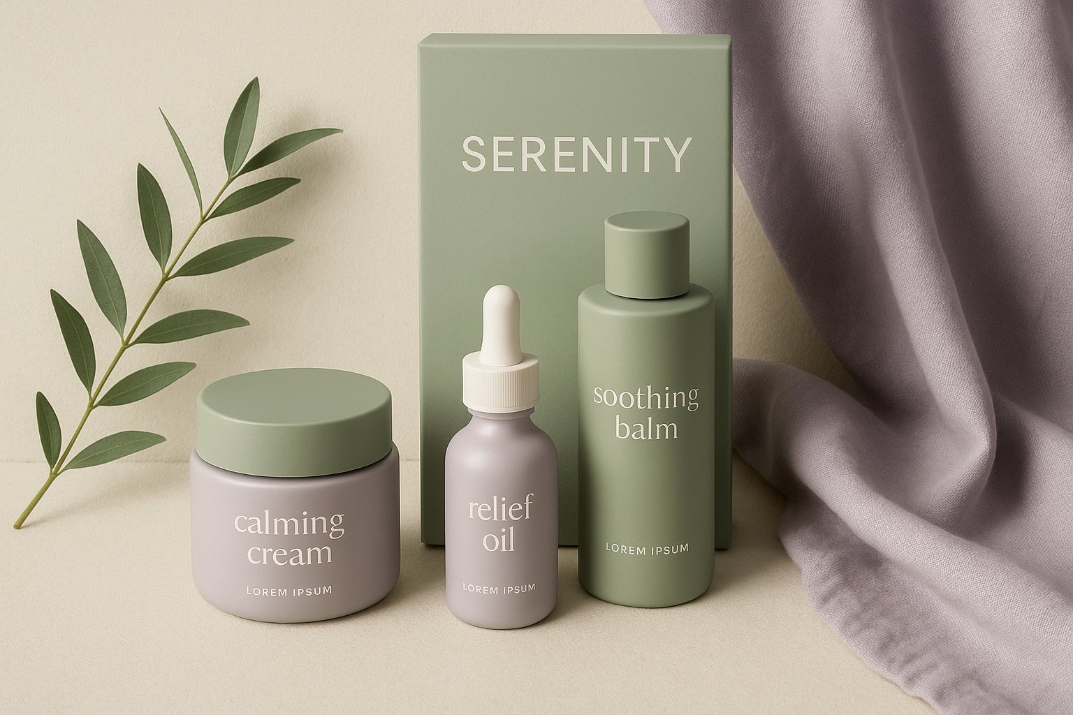
2. Color Psychology Still Matters
In wellness, color does more than look good—it speaks. Common signals:
- Lavender: Calming, sleep-related
- Sage green: Natural, clean ingredients
- Dusty rose: Softness, femininity, care
- Monochrome neutrals: Minimalist, high-end self-care
But differentiation still counts—don’t just copy what everyone else is doing.
3. Typography Should Match Tone
- Rounded sans-serifs: Friendly, accessible
- Serifs with organic curves: Grounded, natural, heritage-inspired
- Script or hand-lettered fonts: Personal, indie, intimate
Avoid harsh, geometric fonts unless you’re subverting the wellness category on purpose.
4. Icons and Symbols Matter
Common cues:
- Botanicals for plant-based or herbal benefits
- Celestial shapes (moons, stars) for emotional wellness
- Minimal dot or line systems for “science meets calm” hybrids
5. Packaging Should Reduce Friction
- Easy-to-read labels with minimal jargon
- Soft-touch materials, easy-open designs
- Subtle tactility or finishes that invite interaction (matte, embossing, soft-touch coating)
If the packaging calms the hand, it reinforces the message.
6. Avoid These Pitfalls
- Overused buzzwords: “Clean,” “calm,” “ritual” with no substance
- All-beige everything: When everything is quiet, nothing stands out
- Inaccessible design: Tiny fonts, low-contrast labels, or untranslatable metaphors
7. Bonus: Design for Digital Wellness
In ecommerce, your packaging preview must convey serenity at a scroll. Include:
- Stylized product photography with soft natural light
- Visual breathing room (white space, balanced composition)
- Consistent iconography and motion graphics that reflect your brand’s vibe
Final Thought
In wellness, your packaging isn’t just the first impression—it’s a sensory experience. A brand that feels peaceful before it’s even opened earns trust faster, and sticks longer.
Don’t just look calm. Be calming. That’s what today’s wellness customers crave—and that’s what your packaging should promise.
s-packaging-peace-visual-identity-in-wellness-brands.jpg