The Psychology Behind Beauty Brand Color Palettes
The Psychology Behind Beauty Brand Color Palettes
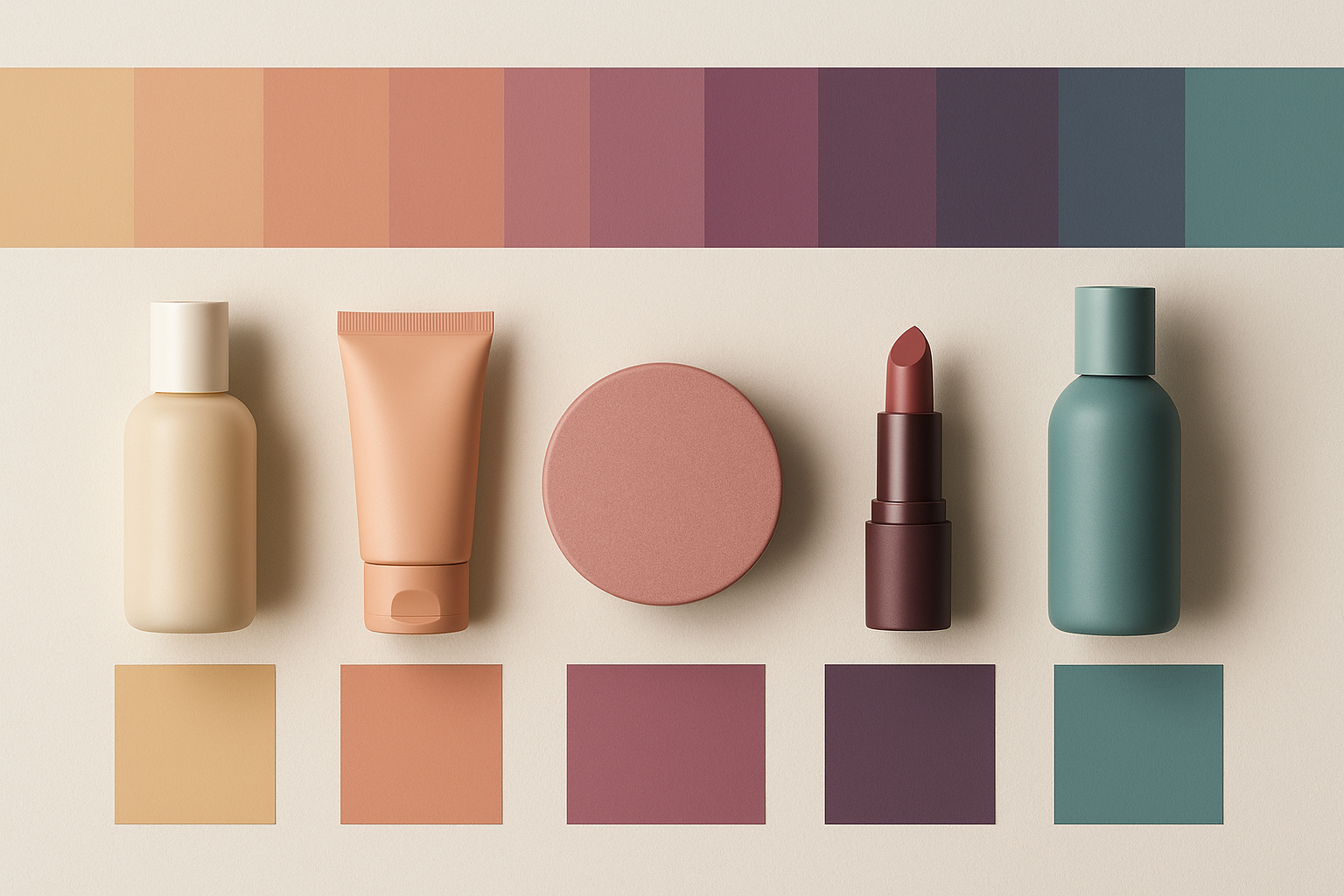
In the beauty industry, first impressions matter—and color makes the first impression. Before a customer ever reads a product label or watches a tutorial, they feel something about your brand. That feeling is often driven by color psychology.
In 2025, as beauty brands compete on shelves and screens, smart use of color is more than aesthetic—it’s strategic. Let’s explore how today’s most successful beauty brands use color palettes to attract attention, shape perception, and spark emotional connection.
1. Color = Emotion
Humans process color in under 90 seconds, and much of our judgment happens before we even realize it. Every shade sends a message:
- Pink: Softness, femininity, playfulness
- Black: Luxury, mystery, sophistication
- White: Simplicity, purity, minimalism
- Green: Natural, clean, restorative
- Gold: Prestige, glamour, opulence
The most iconic beauty brands pick palettes that match the feelings they want to evoke—not just what’s trending.
2. Consistency Builds Recognition
Think Glossier’s millennial pink. Fenty’s neutral tones. Drunk Elephant’s neon caps. These aren’t random—they’re brand assets. When used consistently across packaging, campaigns, and social content, color becomes synonymous with identity.
In a scroll-happy world, recognition equals revenue. Color is your visual fingerprint.
3. Culture and Context Matter
Color meanings aren’t universal. While red may signal passion in the West, it’s a symbol of luck in many Eastern cultures. As beauty brands go global, understanding local color associations is crucial.
Inclusion isn’t just about shade ranges—it’s about palette fluency, too.
4. Natural = Neutral, but With a Twist
Clean beauty brands often lean into earthy tones: sage green, clay, terracotta, soft beige. But in 2025, the movement has evolved. We’re seeing more duality—minimal packaging with pops of unexpected brightness to signal modernity and efficacy.
The new “clean” look blends nature with innovation.
5. Gender-Neutral Doesn’t Mean Colorless
As gender lines blur in beauty, brands are moving beyond “for her” pinks and “for him” blacks. But neutral doesn’t have to be boring. Think slate blue, amber, rust, forest green—tones that appeal across spectrums while retaining visual personality.
It’s about balance, not blandness.
6. Seasonal and Limited Drops Play With Color Psychology
Color is also temporal. A spring line might evoke lightness with pastels. A holiday drop may lean into metallics and jewel tones. These shifts trigger seasonal emotion and create buying urgency—especially in limited-edition packaging.
Plan your palette around mood, not just month.
7. Digital Dominance = Palette Precision
With much of beauty discovery happening online, brands now design color palettes that pop on screens—not just in stores. High contrast, clean backgrounds, and social-first hues (think selfie-ready) are influencing palette choices like never before.
If your palette doesn’t shine on Instagram, it’s losing value.
8. Color as a Storytelling Tool
The best brands don’t just choose colors—they explain them. They use shade names, product descriptions, and campaign copy to deepen emotional resonance. A lipstick isn’t just red—it’s “Rebellion.” A moisturizer isn’t just white—it’s “Cloud Cream.”
Color becomes part of the brand’s voice and story.
Final Thoughts
In beauty, color is more than packaging. It’s positioning. It’s persuasion. It’s power.
Whether you’re launching a line, rebranding, or refreshing your visuals, don’t choose your color palette because it “looks good.” Choose it because it feels right—to your audience, your mission, and your message.
Because in beauty, perception is reality. And color is your first—and most lasting—impression.